![]()
A couple of months ago I wrote up a pretty comprehensive guide on How to Structure a Kickstarter page. We’re still deep in the weeds putting together our Kickstarter for Sigil (launching 05/16!!), and I wanted to share some more tips and tricks that for taking your page to the next level.
Dead Space & Boarders
Kickstarter automatically inserts line spacing between images (the cannot abut against eachother). This means that when create assets for the page you need to take into account that there will be dead white space between them. There are a few ways to deal with this.
1. Combine Assets into Large Images
This is a trick we are doing for our Sigil Kickstarter. Instead of having a headline image, quote, and then what’s in the box image each separately, we are combining them into one master image. We have more control over the flow of the page, and can seamlessly have assets flow into each other without dead space.
You do need to break images (and have dead space) when you want to insert a link, a button or a video. So, eventually you’ll need to plan for the image to end, and how it will transition to dead space or your next graphic.
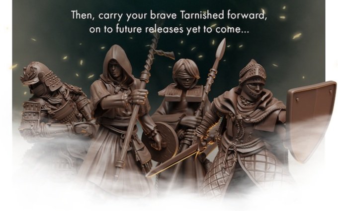
2. Fade Images into the Negative Space
A good example of this approach is the Elden Ring board game campaign. The IP includes a lot of mist effects which the creators incorporated to allow their images to blead into the negative space that Kickstarter forces between images.
دیدگاهتان را بنویسید